Today’s topic was supposed to be all about your favorite cover fonts, but I’m going to be honest with you all, I’m much more of a fan of the overall than the minor, therefore, my post will be about my favorite covers.
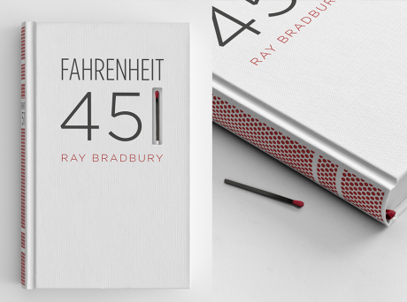
1. Fahrenheit 451 — Ray Bradbury
This is a special edition cover, but I think it is beautiful. First of all, you can light the match on the book, second of all, you can bun the book, which is the whole premise of the story. I think it is amazingly well connected to the story as well as good looking.
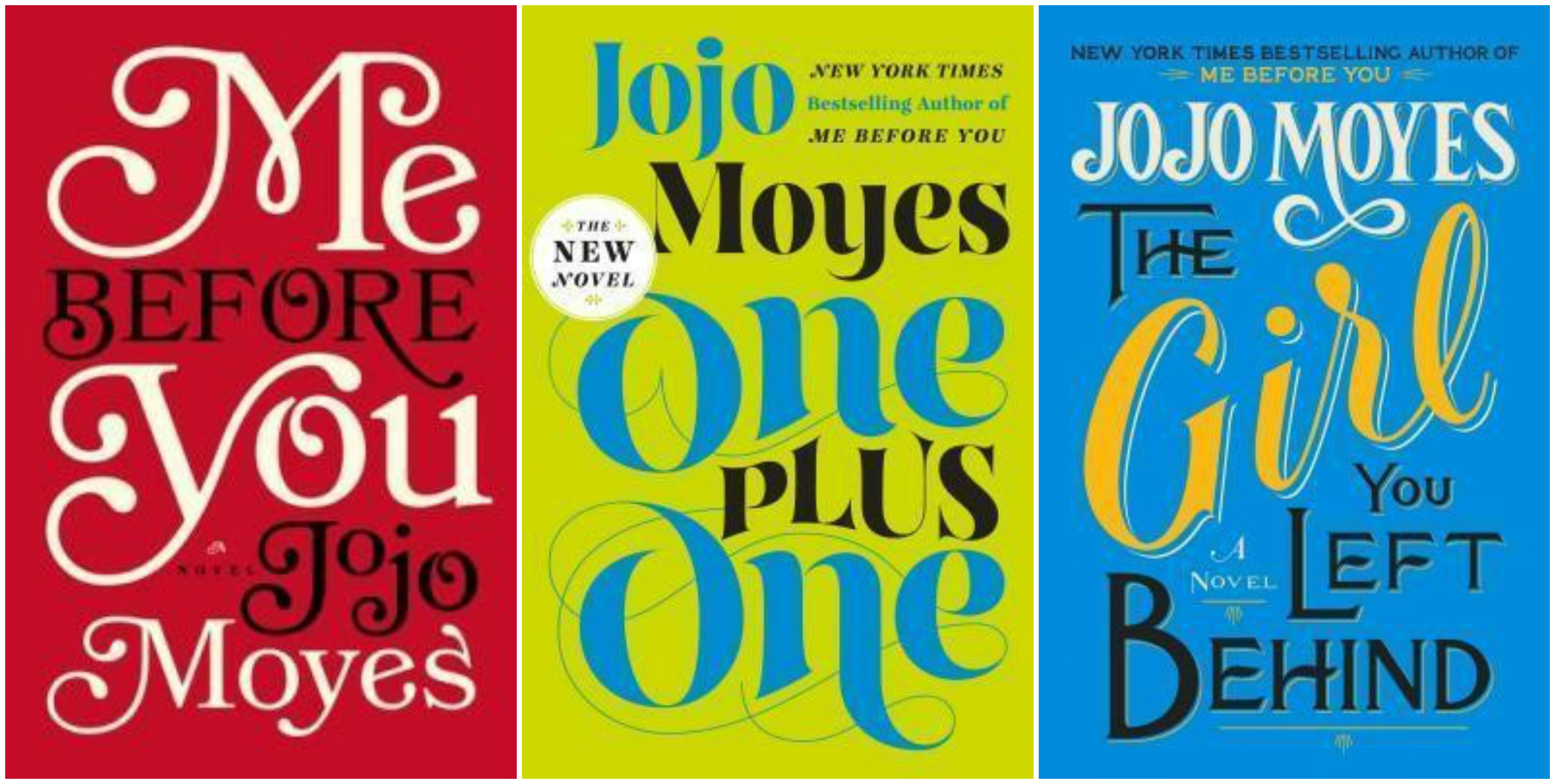
2. Me Before You (etc.) — Jojo Moyes
I love the fonts on these books, and I love how the fonts are used to fill up the cover so that the cover art is the title. I think it is very classic looking and elegant.
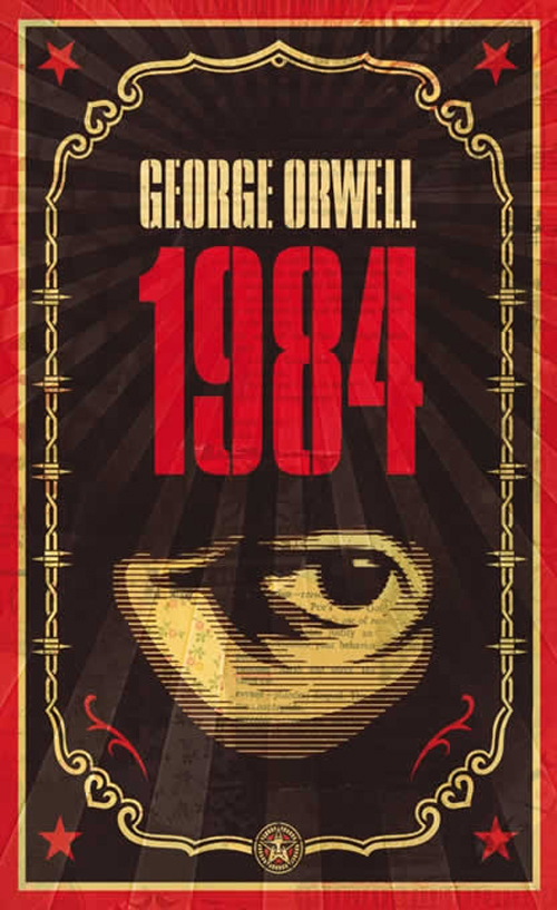
3.1984 — George Orwell
I love this cover art for this book. Not only is it my favorite novel, but I think this cover in particular is really interesting and eye catching.
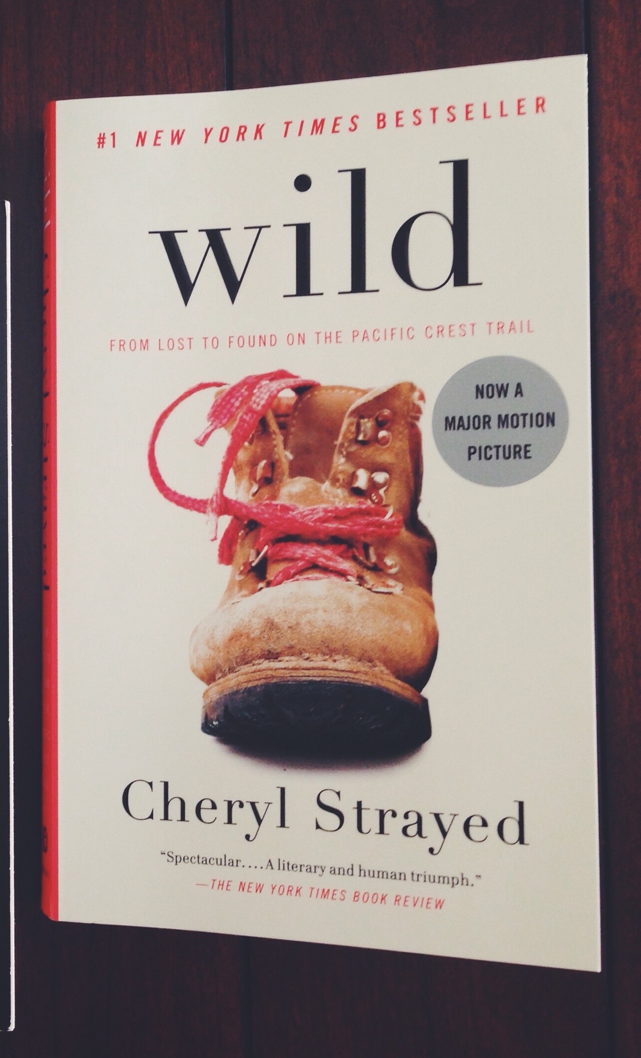
4. Wild — Cheryl Strayed
I was initially drawn to this book because of the simplicity of the cover. I like the font and the choice to leave the “w” in “wild” lower-case. I also love the basic boot and how central her boots were to her travels.
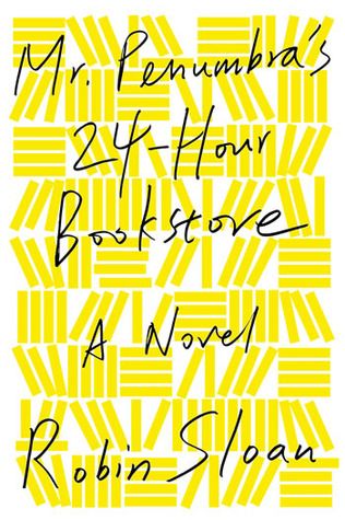
5. Mr. Penumbra’s 24-Hour Bookstore — Robin Sloan
This book cover is so simply done, and I love it. (If you couldn’t tell, I really like simple.) I also do really love this font, but I really really like that the background is comprised of many, many books as well.
Leave a comment below of you favorite fonts or book covers. I would love to hear them!
Happy reading,
Kimberly


Fahrenheit 451 has a pretty ingenious cover! 😉😁
It’s so great!
That cover on Fahrenheit 451 is awesome. Good choices overall! (I didn’t even think of just doing the cover. I just didn’t do it because I’m not a huge fonts person.)
I rarely do the actual challenge because I rarely have enough books to cover. But I love being in the community!
Your blog is beautiful! I’ve tagged you to do the Sunshine Blogger Award; you can find my post here: https://brinasbooksblog.wordpress.com/2015/09/24/sunshine-blogger-award/
Thank you so much!